Owning an e-commerce website is really necessary for every online business to increase the reputation of branks.
Whether you already have social networking pages, a website just for introducing the service or products will drive you to sustainable long-term development.
When building your own WordPress website or hiring someone to design a selling site, you need to keep in mind the following points to achieve the best performance for your business.
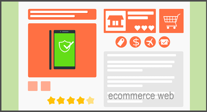
1. Develop a beautiful and simple e-commerce website
A nice website is a must, but it has to be simple to bring the best effect for introducing products and selling online.
On average, each customer will give you 3 seconds to attract them. After these precious seconds, if your website still can’t download properly on a smartphone, you will lose the opportunity to welcome that guest.
The common point for most first- time businessmen on the internet often emphasizes the criteria of beauty in designing a web. Thus, they create a very complex site, this causes it heavy and hard to navigate.
Besides, many websites make customers fall into the matrix of not understanding what they say and sell, or how to buy products from a page they are seeing.
If you let yourself fall into this “pretty trap”, you have failed.
2. Choose the correct font
Once you optimize your site to make it go with simplicity, don’t forget to choose the right font for all the information you write on it.
Ideally, each website should only use up to two different font types. Fonts should be simple, easy to see and read, and avoid confusing. Arial and Time New Roman are good suggestions for most of the pages.
And, also note the font size to help viewers read. Too small or too big will make it difficult to read and influence the aesthetics of your sales page.
Sizes between 14 – 16px should be selected for Arial and Times New Roman. However, with many other fonts, you may have to change the size to suit the requirements.
3. Pay attention to the color of the website
The dominant color must match your company and brand. This also creates a unique impression and one of the best ways to identify the brand for the future development of the company.
The main color for your website should not exceed number 3. Too many colors will make your ecommerce website look like a chameleon. This decreases the focus of customers on the products.
The products and services are the top things to prioritize on your sales website. It is not in the garish collection of colors that you deliberately painted; otherwise, the harmonious colors make your sites elegant and luxury, helping you sell better.
4. Limit using heavy banners and photos
Performance of banners, images, audio, and videos always take up a lot of storage space, causing heavy download. But many website designers have overuse to develop a site.
Many website owners are attracted to these images, flashing banners, which runs on the pages. But, they do not know that these things will kill their websites.
Here is an example. Your bedroom has limited space. If you add more things: the table, cabinet, TV,…. Your room looks perfect and handy. But all these things will take the most area, and you just have one tiny bed. The bedroom needs more comfortable for a larger bed. Is that right?
Your website is similar. The more the sides, the heavier it is, resulting in longer loading times, and your sales cannot reduce quickly.
Just use slides, photos, videos… on your website when absolutely necessary. And, if you use photos, you can install an image optimization plugin to reduce the pixels of them. So, your posts can run fast.
5. Create a part to collect the emails of readers
A website becomes more useful if there is a special offer for customers, which makes the theme willing to register their email address.
These email addresses will become the “gems” for the development of your online business. By now, email marketing is still one of the three effective and cheap methods of online marketing.
Besides, it helps you maintain a long-lasting relationship with your customers and remind them of your presence.
In particular, for first-time visitors, getting their email is important to remind them to return to see your products.
On average, to become your customer, that person usually visits your site from 4 times. Therefore, you must have their emails to contact and send them the invitation to see your sites.
6. Create a simple method to purchase items
Minimizing purchasing steps is vital to turn potential customers into real customers.
You need to simplify the selling steps as possible, from selecting goods to payment. The more steps must be taken, the more complicated the buying process becomes, making it difficult for buyers.
Customers don’t like this, because this is a hassle and it takes their valuable time.
7. Design a friendly sales website
Designing a website that is friendly to viewers is an indispensable criterion in the decoration.
Remember, when you run an online business, the sales website acts as a shop for an offline store. The shop needs to be decorated and polished every day, so does your website.
If you put everything on the front page, they will become a mess. But too few make viewers feel “poor”. You should divide everything sensibly according to each shelf, tidy commodity, science, friendliness.
The color used should be simple enough to be elegant and luxurious.
8. Integrate the sales website with mobile
Most websites designed on the current WordPress platform have responsive features for mobile.
Integrating this feature is essential for readability and is also highly rated and ranked by Google on search engines.
A good responsive website has a large font enough to see on the phone clearly and arranging suitable pictures and texts.
Vertical layout is a must for smartphones because the common habit of using the phone is the people like to glide up and down to read and view information, rarely users scroll horizontally.
Another point also mentioned above is that when downloading on mobile your sales page must have fast download speed.
9. Note carefully on the loading speed to choose a designer
As mentioned above, speed greatly affects your business. When a site loads slowly for more than 3 seconds, Google will mark it as a slow loading site.
Also, the number of viewers will decrease by 30% if the page loads to 3 seconds. With the website downloading on mobile and desktop from 3 to 5 seconds, you will lose about 60% of viewers, from 6-10 seconds you can lose up to 100% of visitors.
Customers do not like to wait. So speeding up the website and optimizing when designing an e-commerce web is absolutely essential for your success.
You need to notice not only the homepage speed but also the loading time of detail posts.
Therefore, when choosing a website design unit, you need to choose a person who also knows the marketing, sales skills, and customer behavior, then that firm will organize your website smartly and ensure the fast download speed.
10. Choose the right domain name and hosting for your sales website
This issue I have said in two articles: What is a domain name? And what is hosting?
Here, you may pay extra attention: Selecting a domain name must match the orientation of your business, product, or service. And with WordPress hosting, you choose the storage in the region or country that has the most potential customers.
In general, an ecommerce website needs to have all three elements to run: the domain name, hosting and the platform chosen to present the content.
And, you can choose the WordPress platform to design a sales website. It is because this platform has good technique, and is easy to manage, use, and do SEO to rank better on the search engine, especially Google.
Do you have any questions about designing an ecommerce website? Tell us below, please!




Leave a Comment
Log in to post a comment.